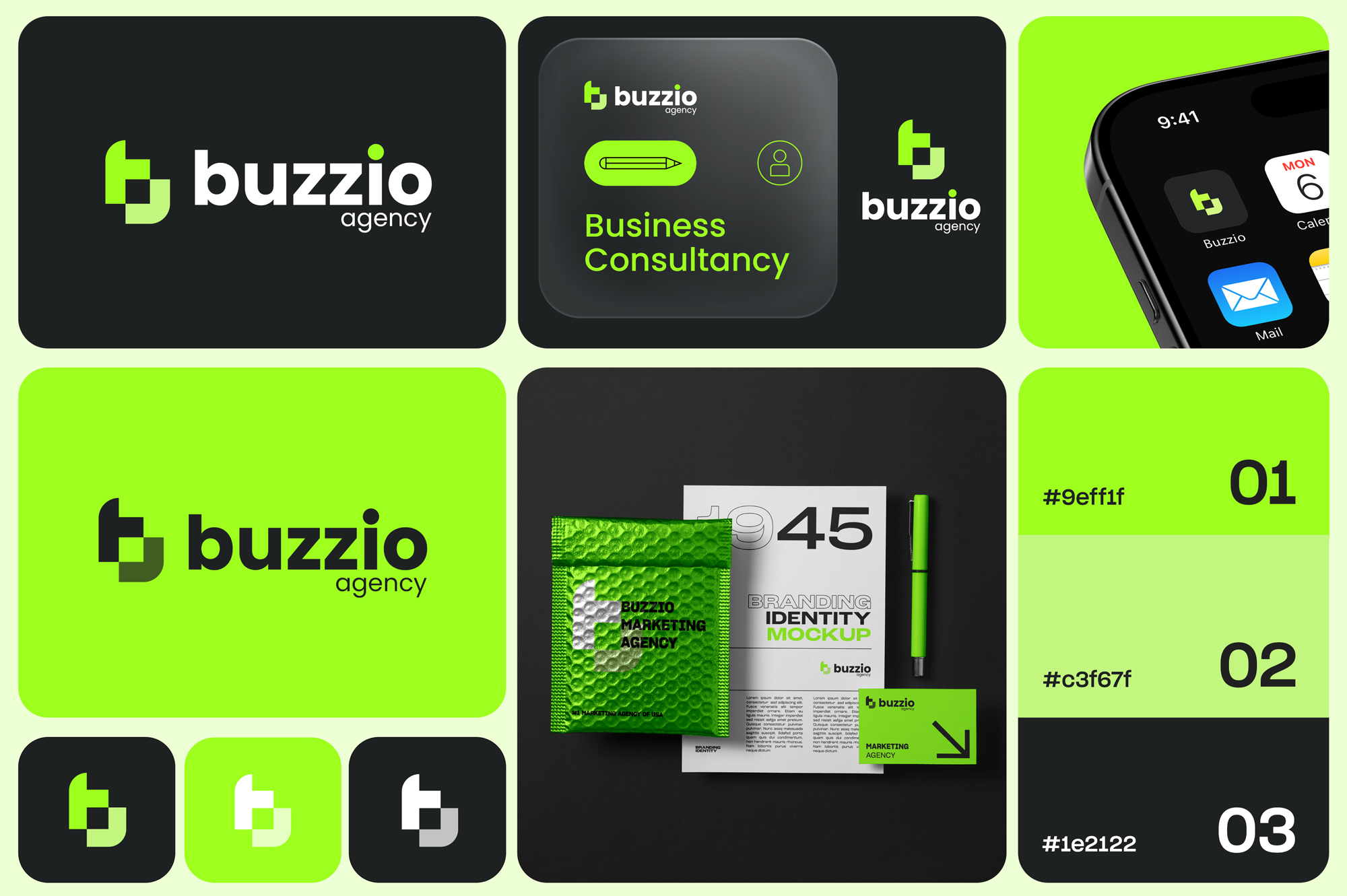
Buzzio Agency.
Buzzio came in with an ambition and a name — they wanted to feel like the #1 marketing agency in the US without looking like every other agency doing the same.
The identity centres on a bold, layered "b" monogram that doubles as a mailing-tag shape — a subtle nod to delivery, results, and consistency. Paired with a high-voltage lime green against deep charcoal, the system feels energetic without being noisy. Applications across app icon, stationery, packaging, and business cards were built into the delivery.
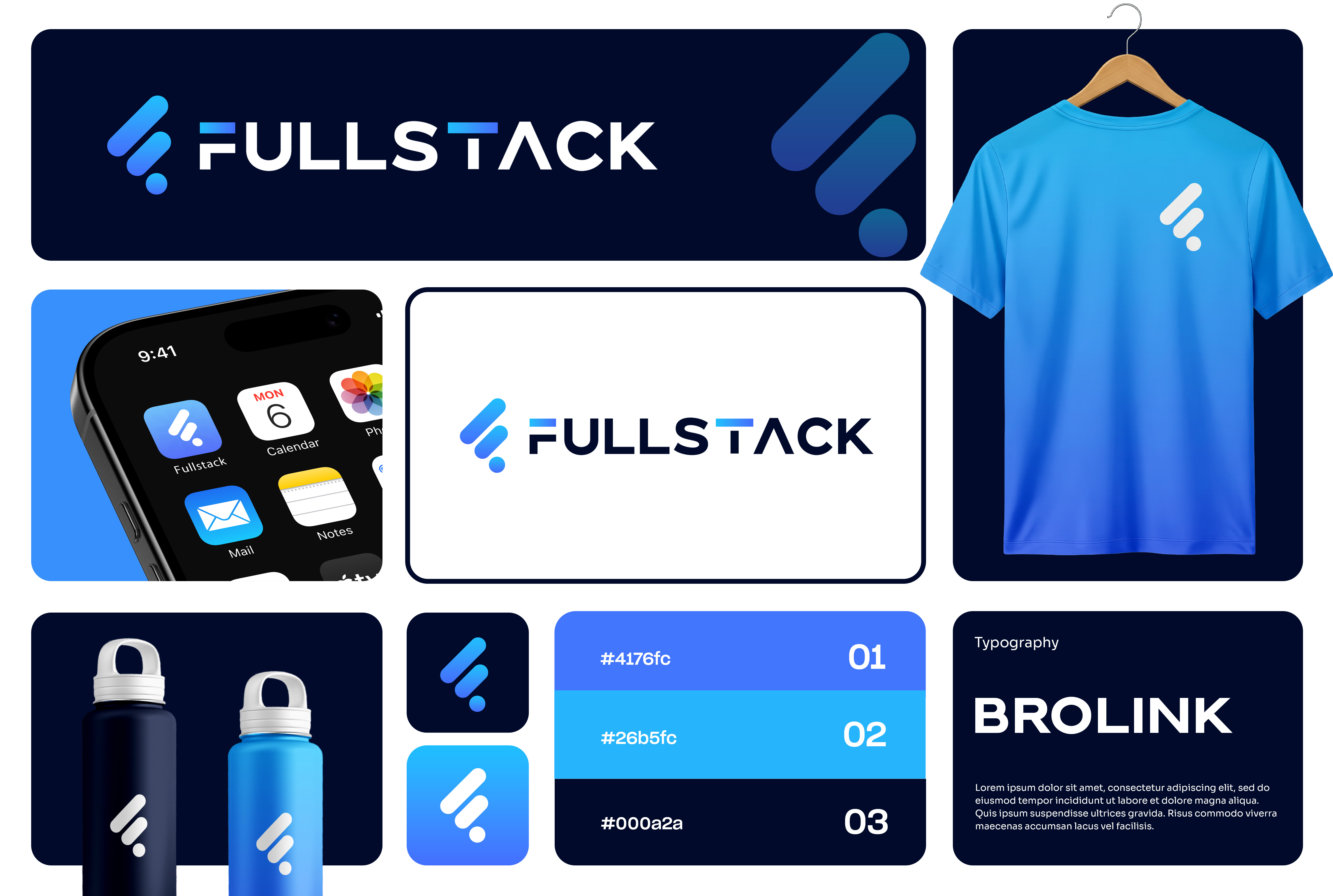
Fullstack.
Fullstack needed an identity that could live at the intersection of development agency and product brand — credible to CTOs, but not so corporate it'd feel at odds with a startup founder's deck.
The mark stacks three ascending forms into an abstract "F" that reads as both code and momentum. A gradient blue palette gives it warmth and dimension, while the clean wordmark stays flat and technical. Applications across apparel, drinkware, and a full typography system round out a brand that scales from dev docs to hero banners.
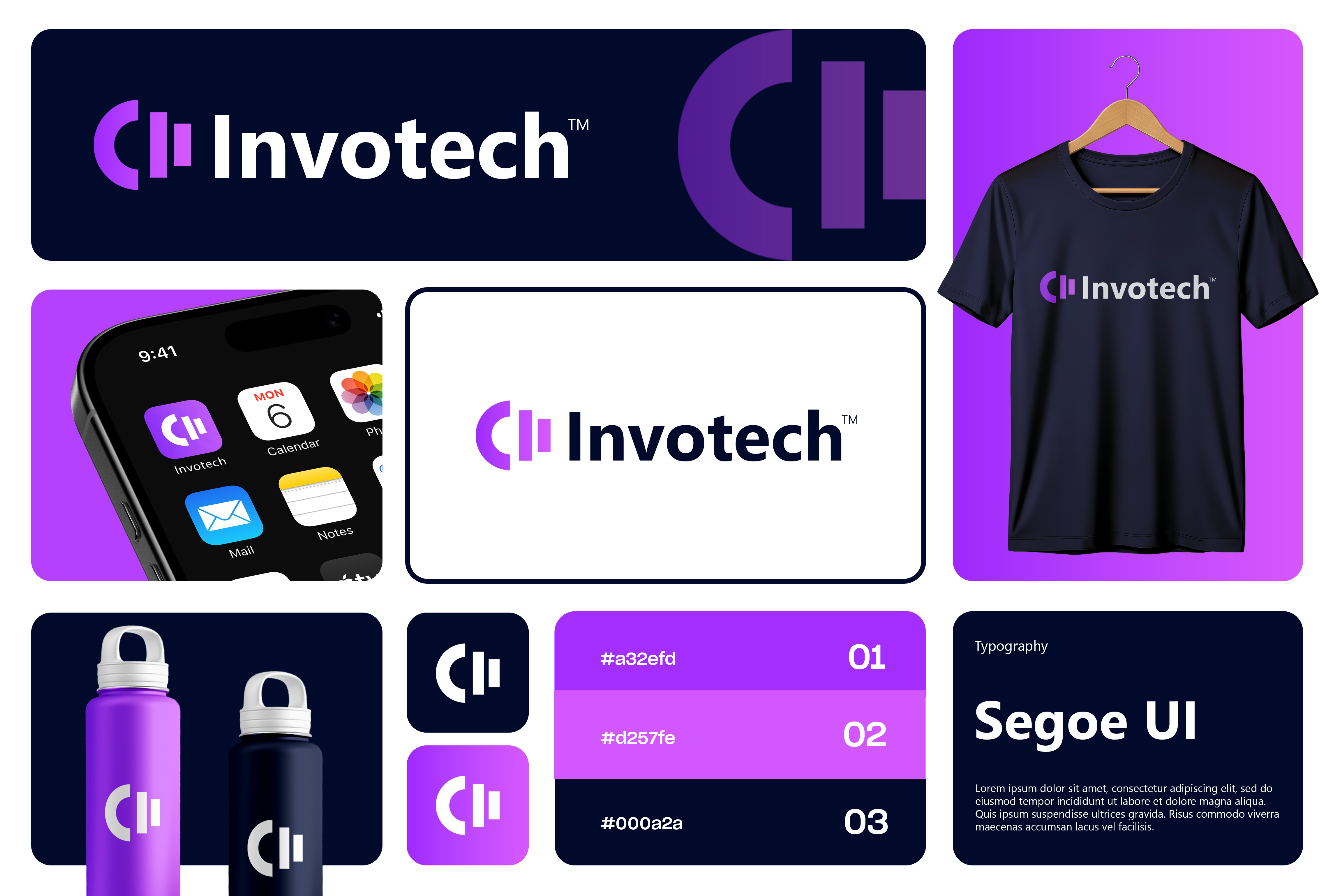
Invotech.
Invotech is a B2B software company whose previous identity felt generic — indistinguishable from every other tech brand using a gradient and a sans-serif. They wanted something that looked like it belonged on a shelf next to Linear and Notion.
The new mark constructs a stylised "C+I" shape using architectural bars — a reference to data columns and structural solidity. Deep navy anchors the system, with two violet tones introducing the warmth the old identity lacked. Segoe UI as the body face keeps the brand feeling native to the software people actually use.
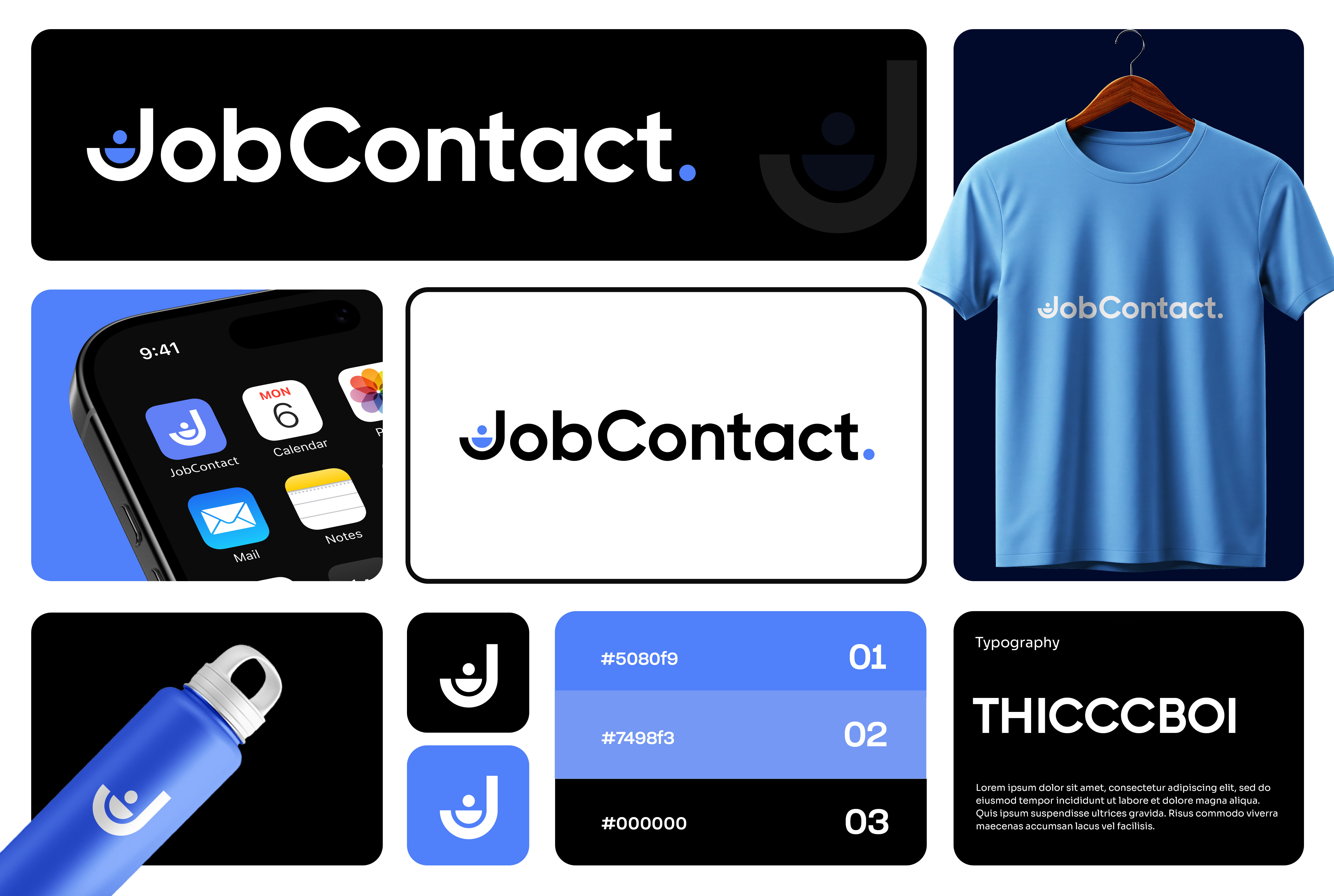
JobContact.
JobContact wanted a recruitment platform brand that felt warm and human — not the stiff, corporate feel of traditional job boards. The target users were Gen-Z and millennials looking for their next role, and the brand needed to greet them, not intimidate them.
The mark hides a tiny person inside the "J" — literally a smiling figure inside the counter — giving the brand personality without sacrificing clarity at favicon size. A confident cobalt blue carries the friendliness, and the Thicccboi wordmark keeps things modern and bold. The full system covers app icon, stationery, and merch.
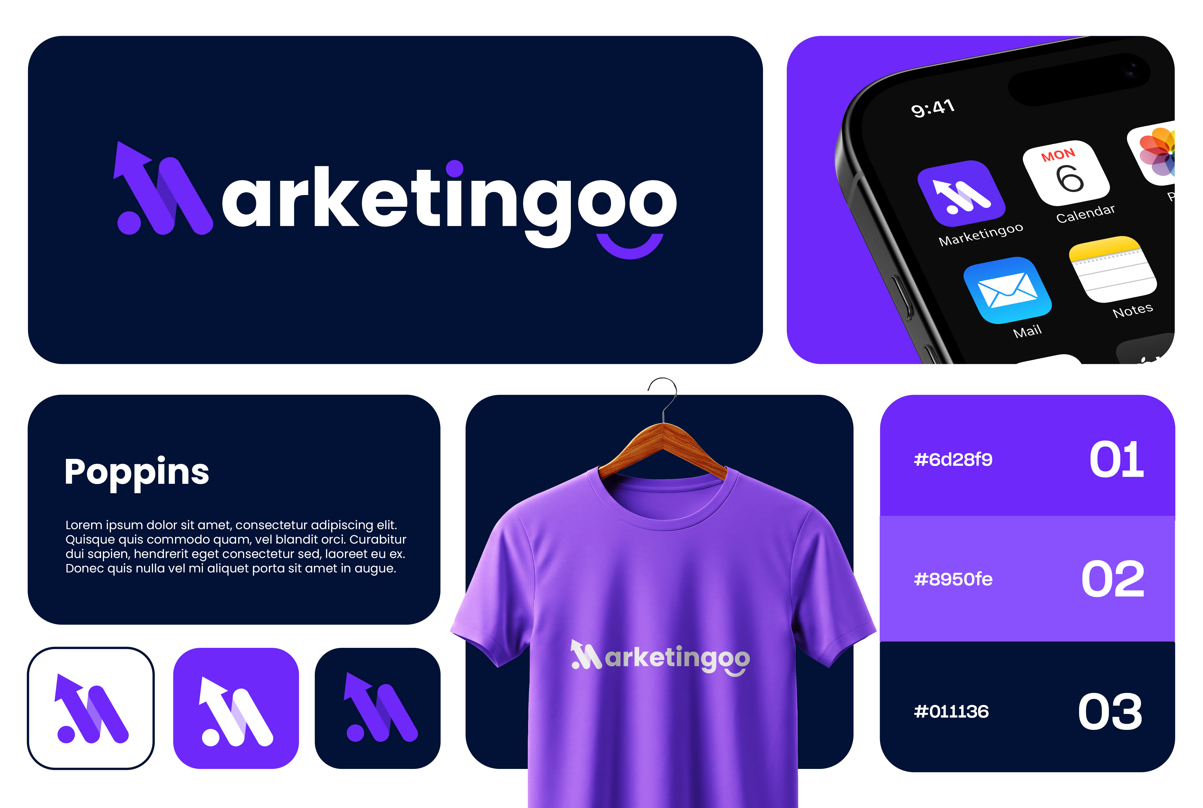
Marketingoo.
A performance marketing agency with a playful name needed an identity that leaned into both halves — serious about growth, cheerful about the process.
The logo uses a custom "M" built from an upward arrow, with the trailing "oo" forming a smile. It's a two-in-one piece of visual wordplay that captures the brand's personality in a single mark. Deep violet anchors it, Poppins handles body type, and the system flexes across app icon, apparel, and social templates without losing its wit.
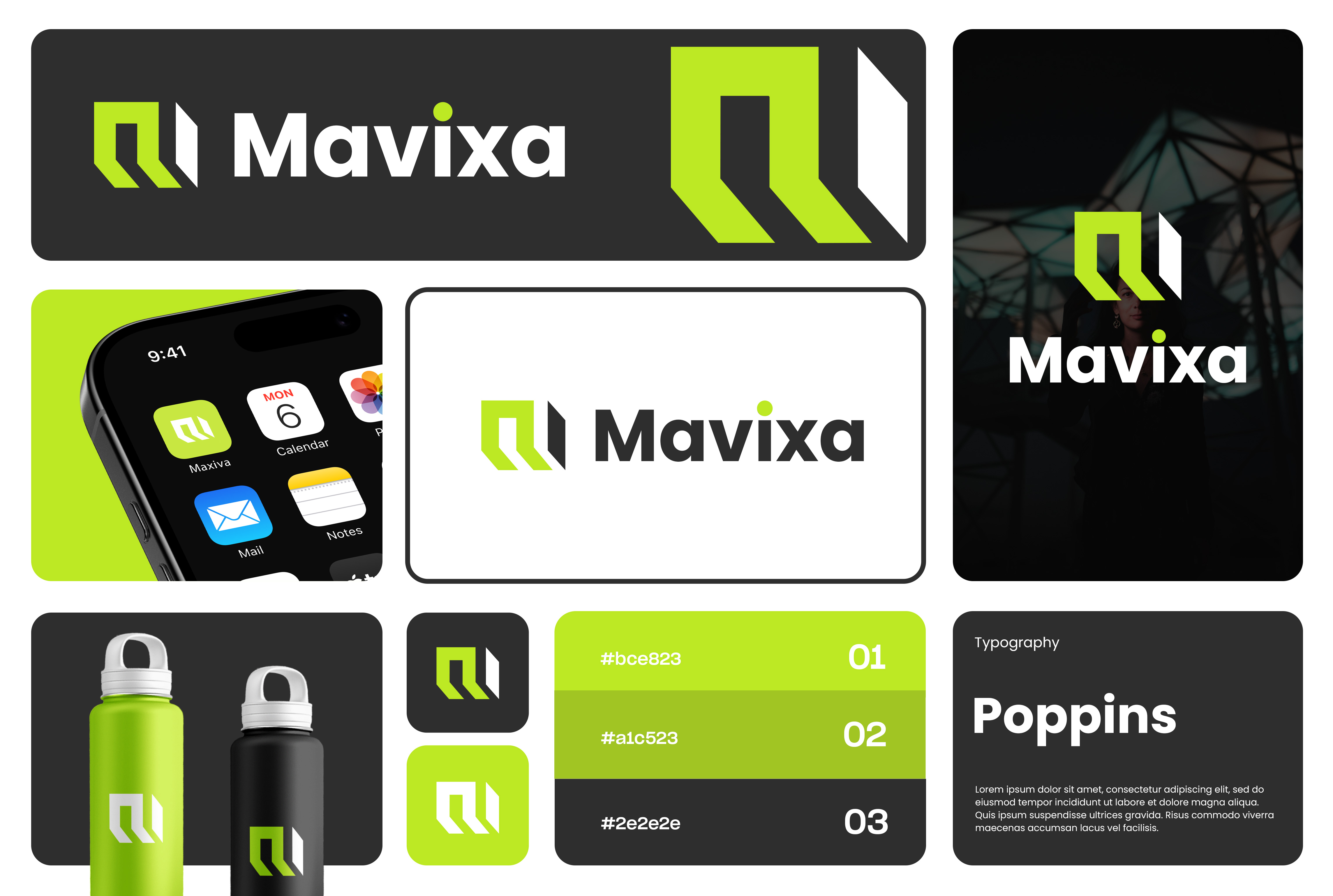
Mavixa.
Mavixa is a business architecture consultancy. The brand brief called for something that felt both structural and forward-moving — not another software-style mark, and not another dusty consultancy logo either.
The solution: a layered "M" constructed from architectural columns, with the back column rendered in high-contrast white to imply dimension and forward motion. A single lime green accent cuts through the near-black palette to keep the identity from feeling too serious. Poppins as the body face, and the system extends across apparel, app icon, and environmental mockups.
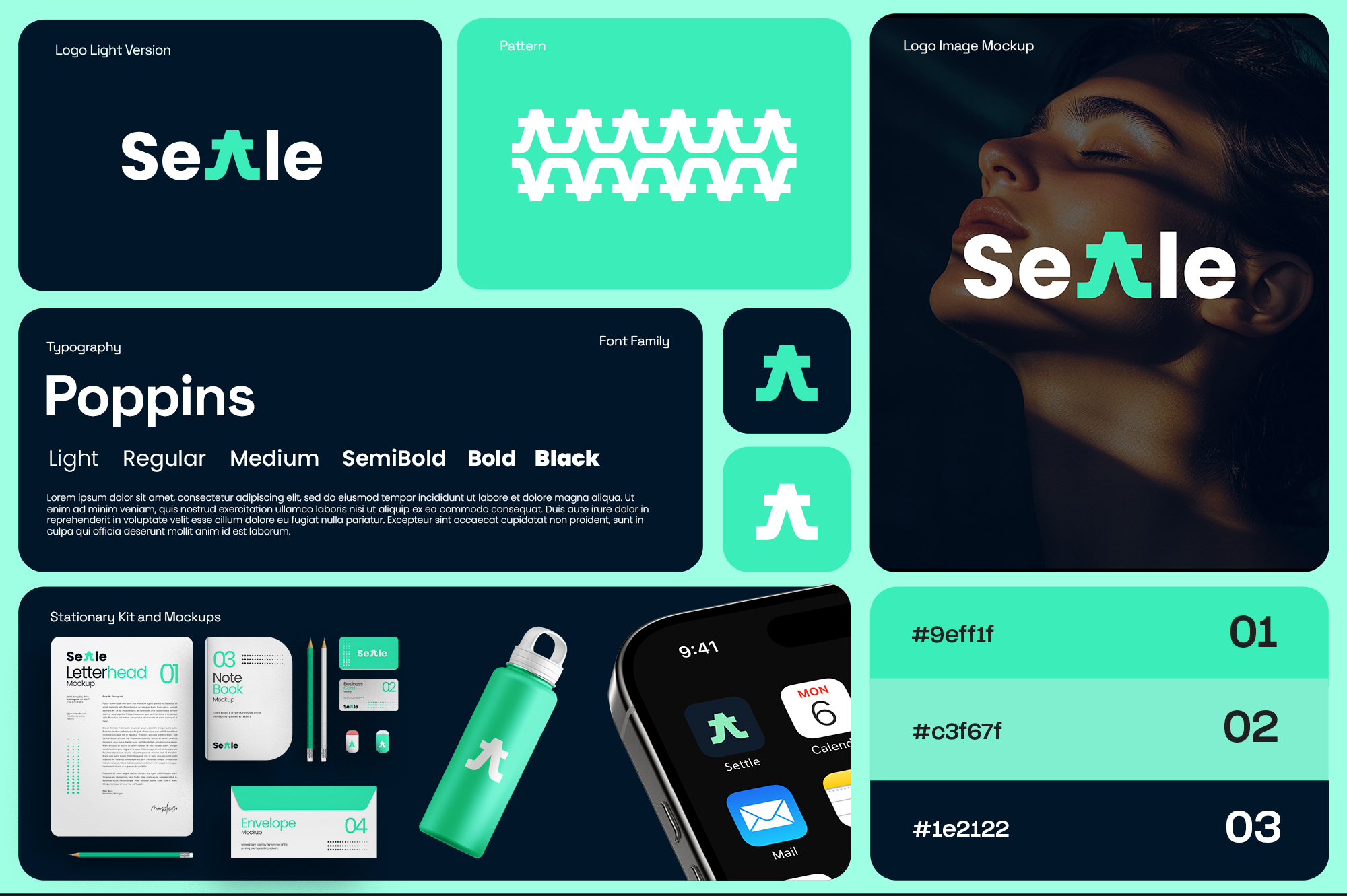
Settle.
Settle is a wellness and mindfulness app. The brand needed to feel calm and centred without being bland — most competitors in the category defaulted to pastel gradients and soft serifs, and Settle wanted to break the mould without losing warmth.
The logo's cleverness is in the middle: the two "t"s fuse into a single person-with-arms-raised figure, turning the wordmark itself into a micro-illustration of the brand's promise. A fresh mint-to-teal palette paired with Poppins gives it a modern wellness feel, and the full delivery included pattern system, stationery kit, and app icon.
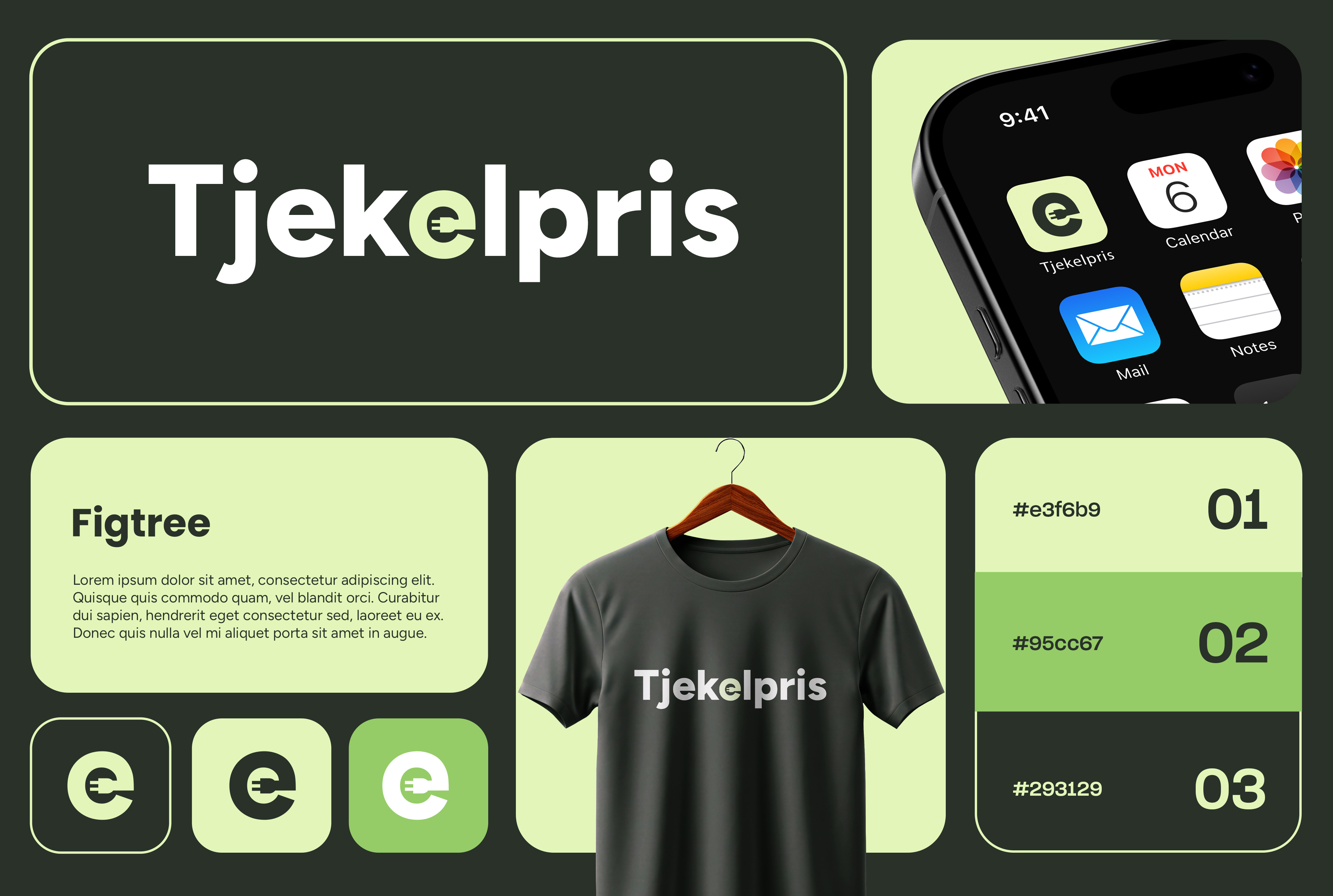
Tjekelpris.
A Danish energy price comparison platform — the name translates to "check the price." The brand had a dry, utility-first category to stand out in, and needed to feel helpful and trustworthy without slipping into financial-services cliché.
The wordmark's central "e" is reshaped into a stylised electrical plug — an immediate visual tell of the category that never feels on-the-nose. A lime-green accent on deep forest green gives it energy (literally), while the chunky Figtree face keeps everything approachable. The identity extends across app icon, apparel, and a clean usage system.
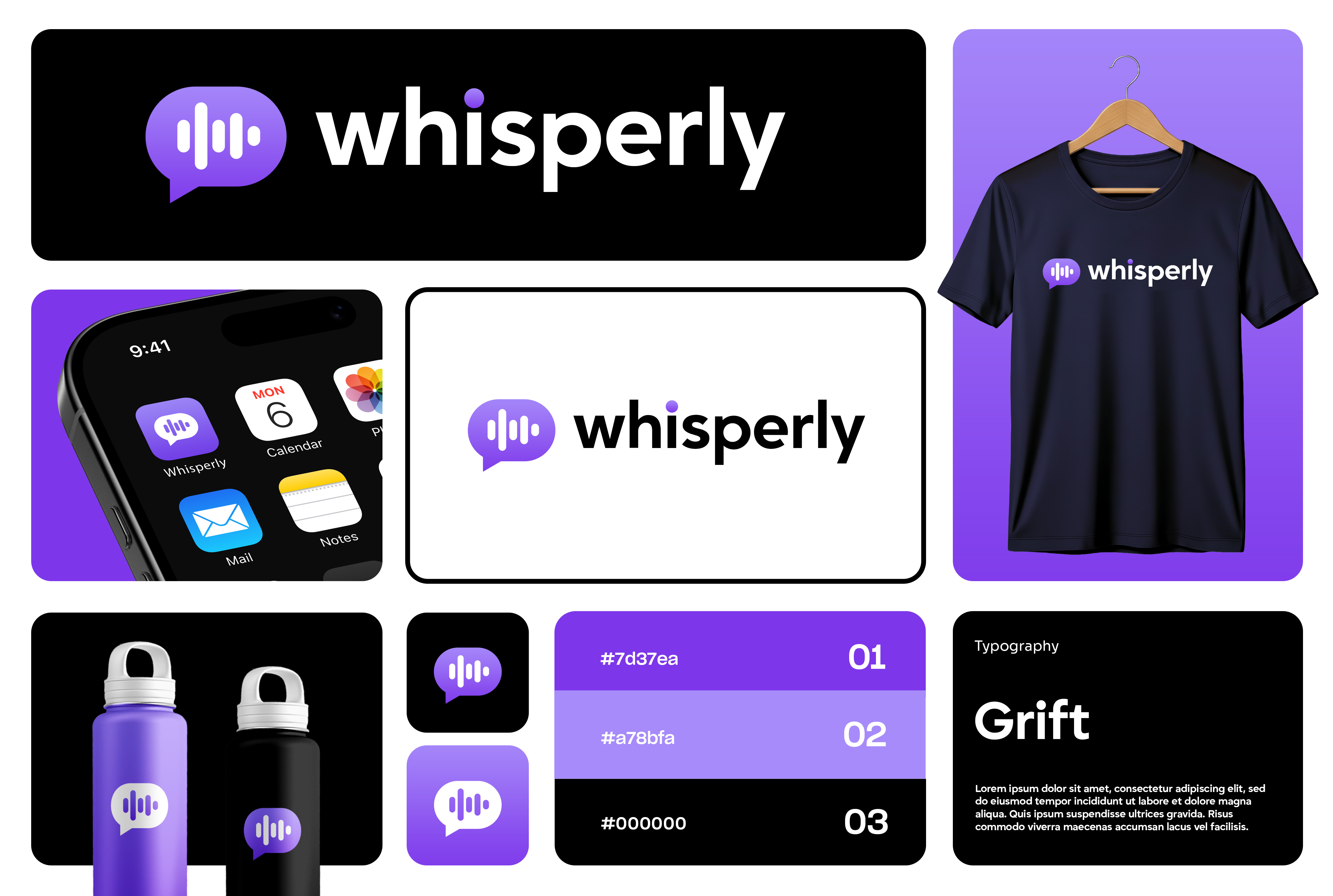
Whisperly.
Whisperly is a voice-to-text and audio messaging app. The identity brief was specific: the brand needed to suggest both voice (waveforms) and messaging (conversation) in a single mark that read instantly at app-icon size.
The logo fuses the two ideas literally — an audio-waveform pattern sits inside a speech bubble, with a floating dot above signalling a live message. Rendered in a soft violet gradient against black, the mark reads clearly from 16px up. Grift as the body face gives it a contemporary, slightly technical edge. System delivery included app icon, apparel, drinkware, and full colour specs.